
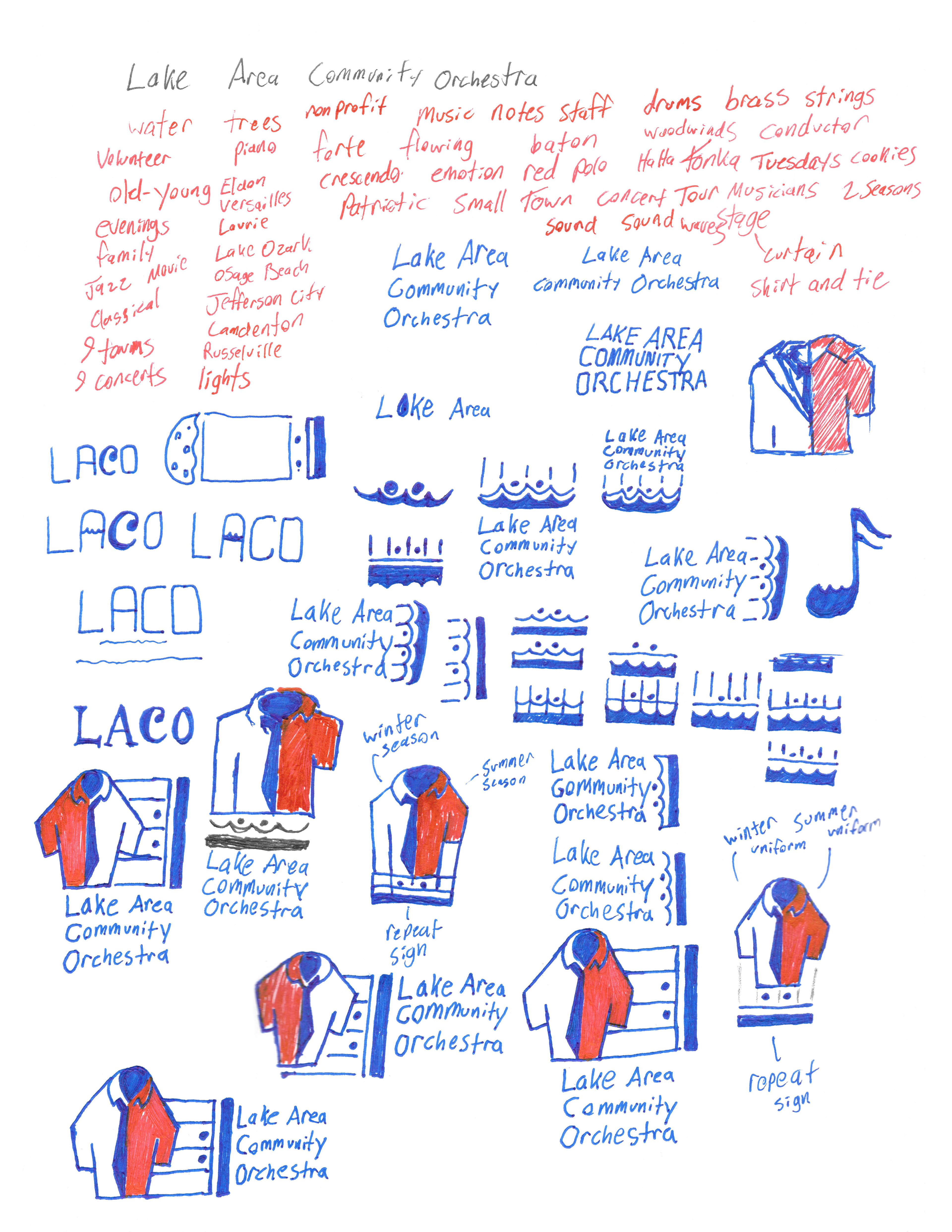
All good things start with throwing things at the page and seeing what sticks... #ideation. Every word or image that pops into my head has to be on the page somewhere. From that, elements are added and removed until eventually I arrive at something that looks pretty close to what I want.
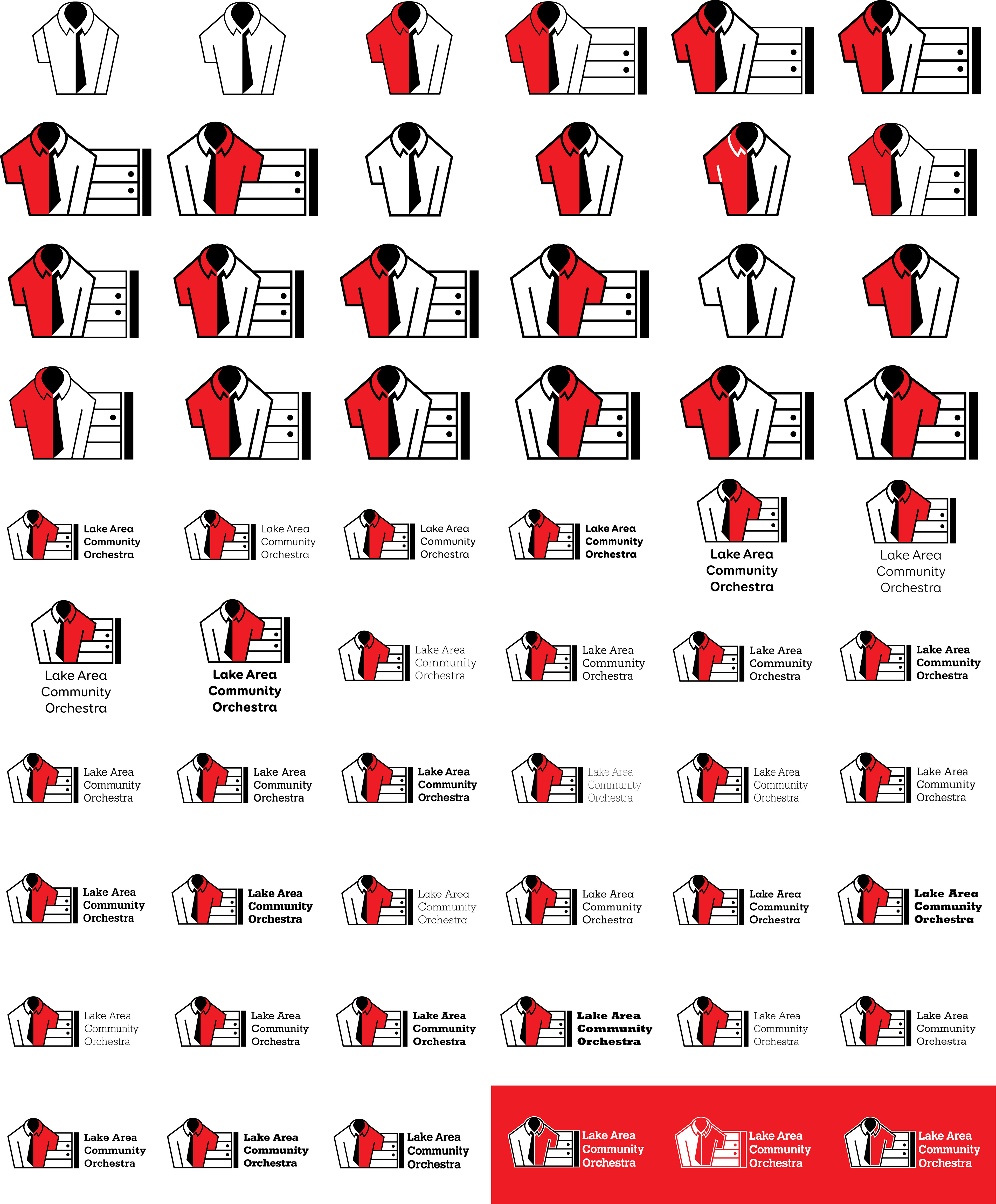
Working with vectors is like eating a thousand cookies (a LACO tradition) after the concerts and not gaining a single pound. You can pump out artboard after artboard and not feel guilty about filling your hard drive. Eventually, this mass of logarithmic majesticness brings you to a conglomerate of tiny adjustments that harmoniously fit together and form a logo.
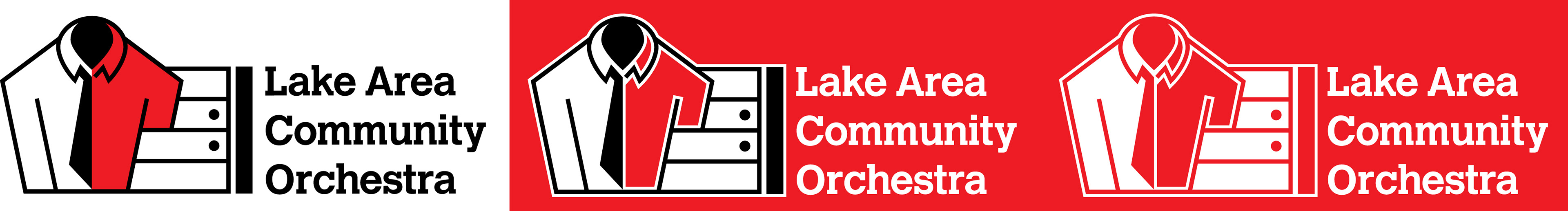
By the the time it was finished, I had a logo that encapsulated what I felt were palpable attributes that members and audiences alike could easily trace back to the orchestra. It featured both the winter (a tie and a white shirt) and summer (red polo) uniforms. I felt that this would also convey the varied skill levels of its members (everything from students to accomplished professionals). Next to that was the musical notation for repetition. Every season, you could expect the orchestra, with the same two uniforms, playing the same venues year after year. Members come and go but these things remain constant. After that, was the name written in a typeface that felt both classic and modern. Like its members and audiences, the typeface needed to pay homage to those who came before while looking towards the future. It needed to be as timeless as Beethoven.